branding identity
Branding identity
Digital & print assets
Social media marketing & strategy
I worked with a New York based agency to create a full branding identity for their client - the florist Moyo Obajasu. They were revamping the whole company and what a better place to start than rebranding their visual identity?
Opening a new bigger and brighter store in the vibrant Upper West Side in Manhattan definitely needed a different approach - an elegant, exquisite branding with a touch of luxury across all web and print assets.
building it from scratch
I used their three favourite colours in order to create the new branding palette - sage green, deep burgundy and soft cream. I created a logo using a strong typeface, which would also be implied on any text accents, a delicate sans serif for fine touches and a web-friendly Montserrat for all main body text. They also needed a logo mark representing the nature of their business - floristry. I made an elegant geometric floral ornament with a timeless premium feeling which would later on tie well together across all other branding assets for pattern development.
ad campaign posters
Later on when I developed the posters for the outdoor / billboard advertising campaign my client was so happy with them that they asked me to adjust the same layout for the posts on Instagram, banners for Facebook and animated paid ads on Google.
I was also in charge of the copyright text - it all started with a few fun catchy phrases which they liked a lot so I was asked to create more and more assets promoting their company across all platforms.
MAKE IT FOR THE PEOPLE
I picked the imagery taking into consideration the functionality and value it would bring for any human. People celebrate life, love, big and small achievements, the loved ones and any other reason thatchy may have to get a beautiful flower bouquet or bring home a cool potted plant.
The ad campaign was mainly targeting bringing people back to their physical store after the pandemic but we also did an online one towards ones living in the neighbourhood to increase sales.
packaging & pattern
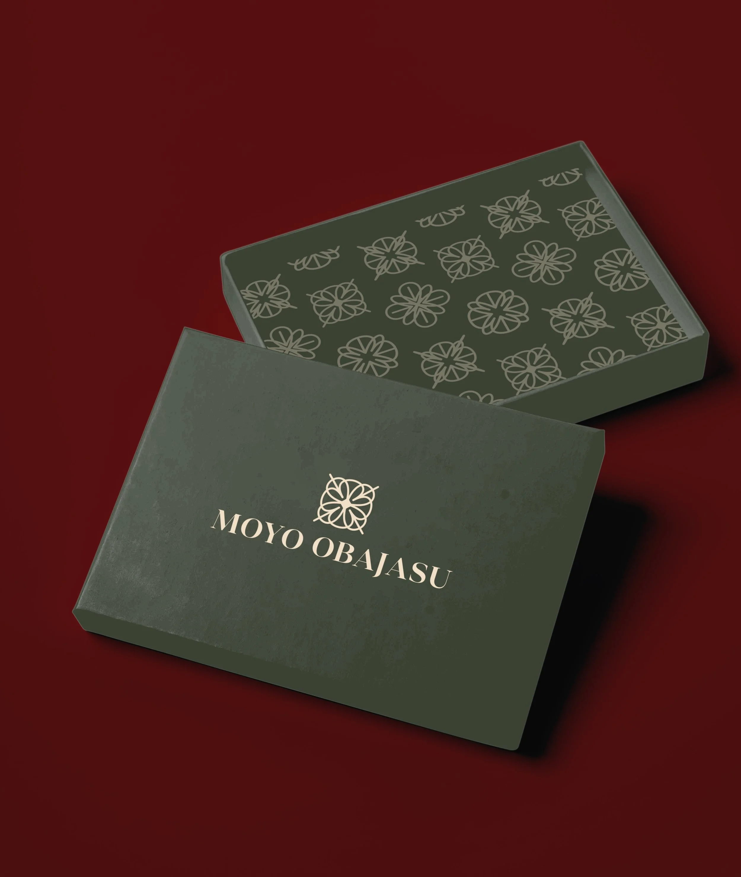
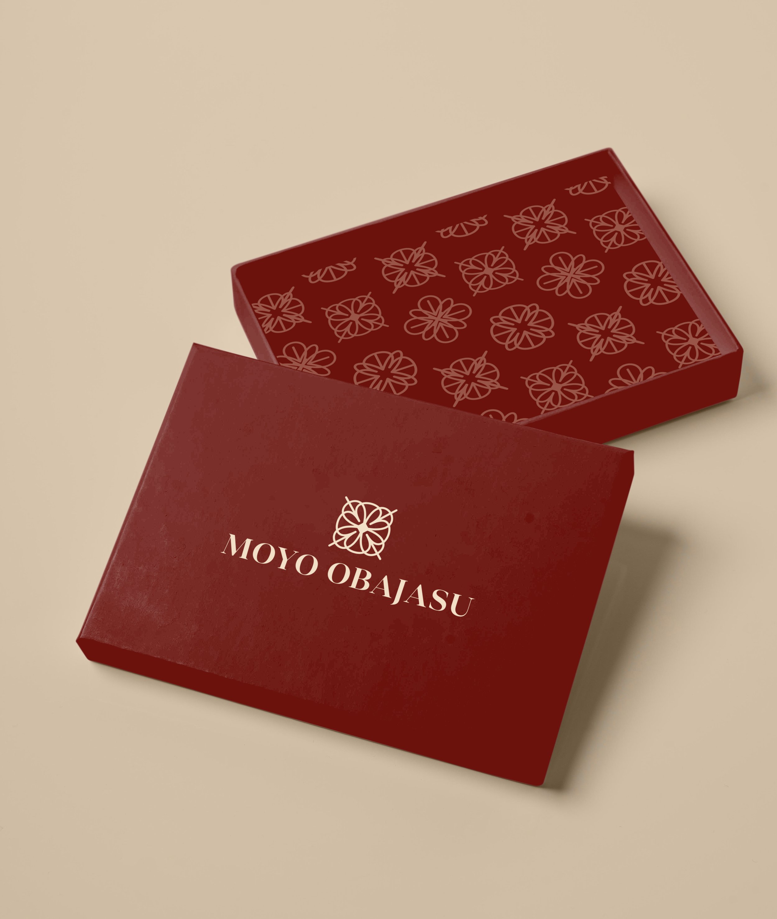
I created the print assets for packaging - custom flower boxes, gift bags, stickers and wrapping paper. The logo mark was a starting point for my repeat pattern inspiration - I created an intricate geometric floral one, tying well together all assets into a beautiful cohesive branding.


merch
The etiquette of the shop needed everyone working inside to wear a branded apron. All shop assistants, gardeners and cashiers get their colour so that the clients and the staff can easily communicate - green for gardeners, red for shop assistants and cream for cashiers.
Repeat pattern tote bags are also available to support the shop and honestly who doesn’t love a good denim tote - besides great branding asset, they’re sustainable and you can carry them everywhere.


