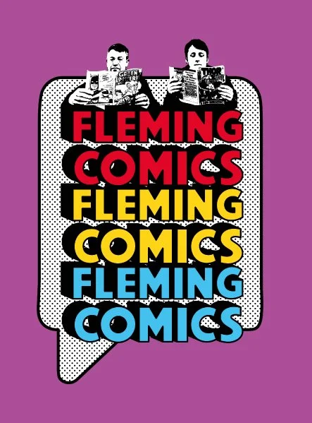
Branding identity
As a Hackney resident I was approached by a local business to create their branding identity. Fleming Comics are a small family comic book business trading at conventions for the past 15 years working with comics from the 1940s-1980s. They were now moving into e-commerce and wanted to expand their loyal customer base.
Hence they needed a fresh, modern and personal logo to be used for their new online store and Instagram profile. The main idea was to incorporate the both owners, father and son into the logo, holding a comic book and thus giving a very personal spin-off. I was provided with a guide image and asked to touch base with the primary colours for comic books which are red, blue, yellow and purple.
Case study:
Initially I presented a couple of routes touching ground with the comics visual essence - super bold and thick typography headers, which looked perfect for the logotype. Additional web-friendly fonts were also introduced to keep the branding consistency through print and digital. The typography hierarchy was a primary header in all caps, secondary - as body text typeface and then the tertiary font - as an accent text for quirky notes. All colour codes had to have CMYK properties in order to appear correctly across print and digital assets. I gave them a cool names following the comics ethos. After that I brought in a lovely paper texture options as a background to keep the branding tightly linked with the comics nature.
selected route:
Following the received feedback I adjusted the final files accordingly - the client loves my personal illustration style so they wanted it embedded inside their branding identity. The final logo became a lock-up consisting of a logomark with an illustration and a logotype with custom drawn typeface.
For the rest of the assets we kept the web friendly typefaces - an all caps sans serif header font, a legible beautiful serif for the body text and a fun handwritten accent one for any additional notes.
The client loved the proposed purple code hence it became the primary branding colour and I created the colour hierarchy following with a little bit of sky blue, bright yellow & least used colour code became the red.
Branding book
Another part of my brief was to create the branding book. The importance of having one is crucial once any business starts expanding. Such instruction manual detailing a brand's personality comes off very handy and can always be upgraded and updated over the years. It preserves the business’ personal brand history, visuals, voice, and mission which are essential for any communication and shows how & why it stands out in the market.
We agreed to have a vectorised photo as a secondary asset and following this direction I exported several more branding elements, which again were closely tied to the comics nature - brackets, speech bubbles, stars, dots, squiggly lines and so on in the same nature.


